Why Charts Are Your Best Friend in Retirement Planning


There’s a moment I notice in almost every retirement planning discussion:
a pause, a smile, a quiet moment: “Ah… now I understand.”
That moment usually occurs when we look at a chart.
Not a spreadsheet. Not a thick report.
Just one clear image that reveals the shape of someone’s financial future. It’s often at that point that numbers transform into something more powerful: Clarity.
The Magic of a Simple Chart
Retirement planning doesn’t have to feel daunting. At its best, it provides clarity, like unfolding a map that reveals exactly where you are and where you’re heading.
Take James, a 50-year-old engineer contemplating whether retiring at 60 is achievable.
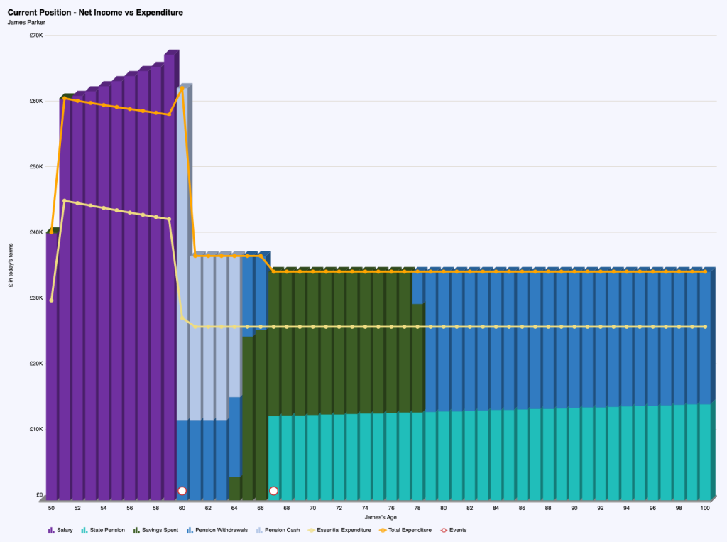
This single chart brought James’s future into focus:
It shares a comforting story:
✅ James can comfortably step back from work at 60
✅ His mortgage is cleared at retirement
✅ His income flows from a smart blend of sources
✅ Even in later life, his spending is fully covered
This kind of visual clarity helps people move from guessing… to knowing. From hesitation… to confidence.
Why Charts Matter
We make better decisions when we can see what’s possible.
Charts give you what a pension statement never will: Context.
A well-built financial chart can show you:
- They turn big questions into confident decisions.
Why Charts Are Your Best Friend in Retirement Planning
That’s what most people want to know.
They’ve worked hard. Saved diligently. Built enough, probably.
But without context, it’s hard to feel certain.
A clear chart like James’s helps you stop guessing, and start shaping the life you really want.
Want to See Your Picture?
If retirement still feels like a blur — or you’re wondering how close (or far) you really are…
It starts with a conversation.
And just maybe, one chart that changes everything.
👇 Book a free Retirement Clarity Call 👇


